on
Creating my Portfolio
I had been wanting to make my own portfolio website for some time. As a web developer, it’s a good way to showcase your work and highlight some of your projects and experiences. I had a few goals in mind for my portfolio:
- Keep it simple
- Don’t use any sort of template
- Integrate some new technology into the site
Simplicity is always one of my primary goals in whatever I’m designing. I wanted my site to be entirely custom-made, so templates were a no-go. Lastly, I wanted to use some sort of recent web technology to showcase my adaptability in the rapidly-changing world of web development.
I had recently been watching a lot of Layout Land, a video series by Mozilla and Jen Simmons. In it, Jen details a lot of new technologies that are redefining the way we approach layout and design on the web. A big focus of the series is CSS-Grid. I’d been fiddling with Grid on my own for some time, but Layout Land gave me the inspiration to use it for the layout of my portfolio.
For the actual design, I sketched a few ideas out before settling on something resembling the following:
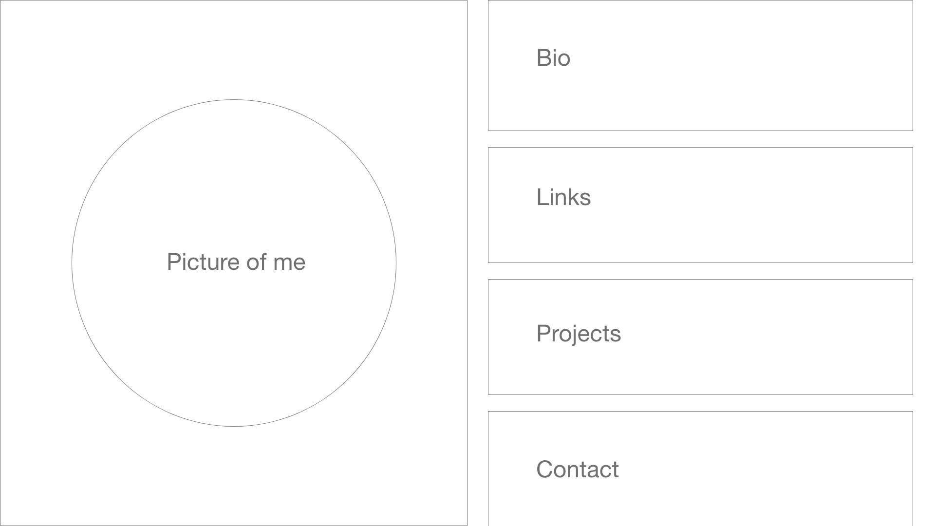
I liked the box-centric design for the content on the right. It would be fairly straightforward to implement, and it would be easy to adapt for a mobile layout. The picture on the left gave the site a personal touch, and I figured it would be a good opportunity to fiddle with some helpful image-handling CSS properties like object-fit. Before too long, I had the following design:
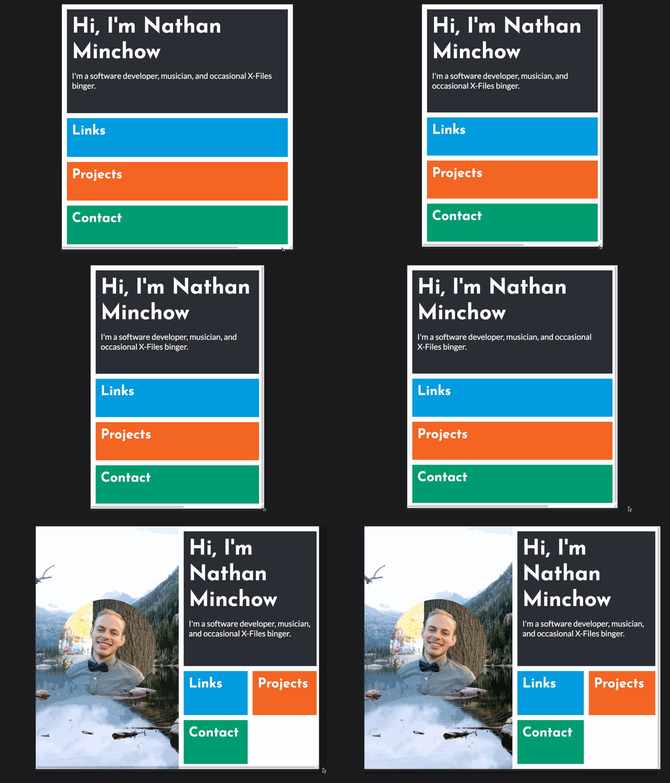
I wanted some personal touches in my portfolio, so the background image on the left side of the site is a photo I took at Mills Lake in Rocky Mountain National Park (which is my favorite hike in the whole park!). Grid was used for the content on the right. It was two columns and simply took up all the free space available, and it switched to one column for the mobile layout. It was a pretty small amount of CSS overall:
main {
  display: grid;
  grid-gap: 15px;
  grid-template-columns: 1fr 1fr;
  height: 100vh;
  padding: 15px 15px;
  box-sizing: border-box;
}
@media (max-width: 700px) {
  main {
    grid-template-columns: 1fr;
  }
Grid is great! Of course, some of the actual content boxes had their own CSS, like the top biography which spanned both columns. For the most part, however, this CSS was the bulk of my layout.
Unfortunately, I soon ran into a problem when I actually added content to the site:
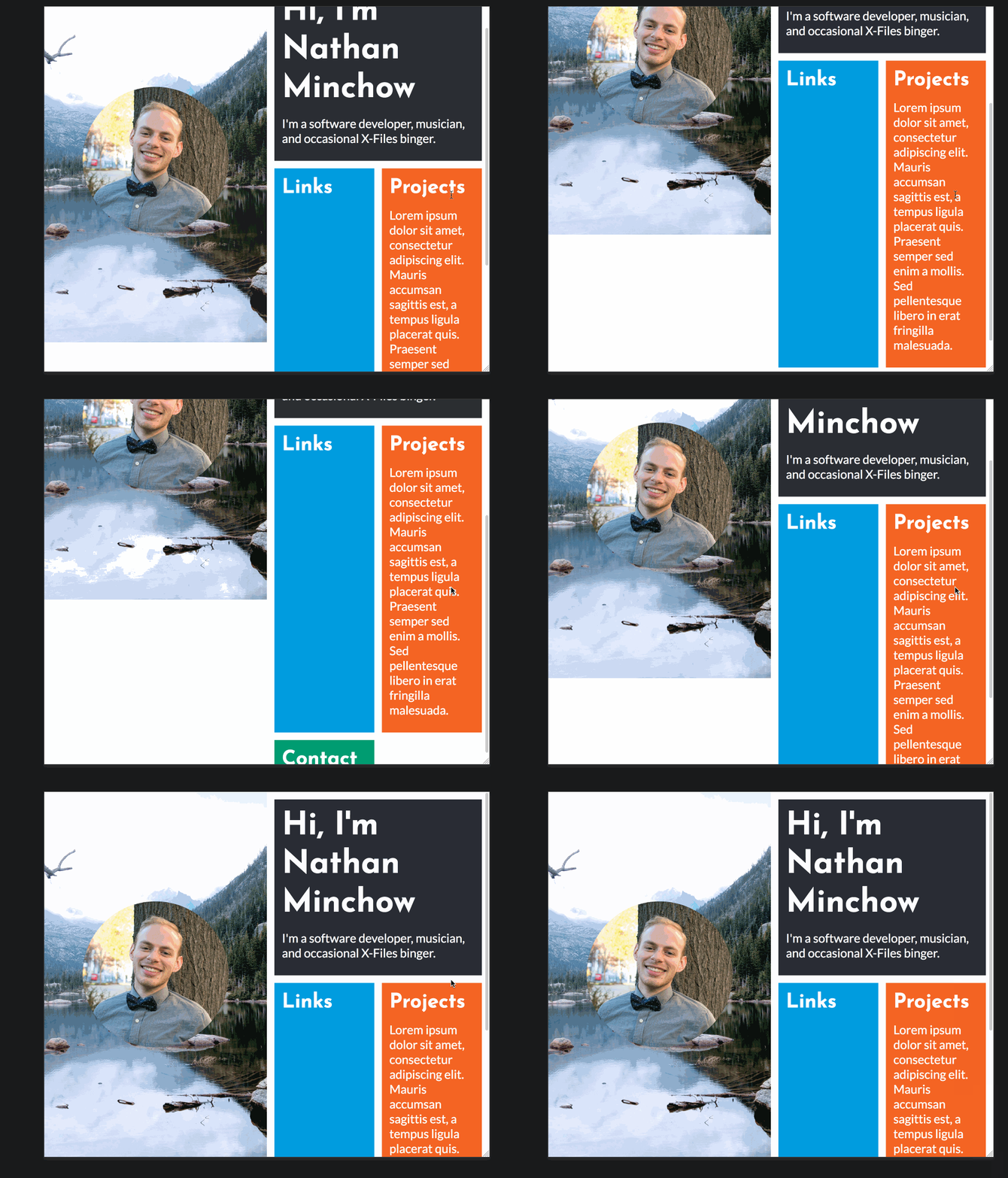
I had designed my layout perfectly for the scenario when everything fit nicely onto the page, but a relatively small amount of content broke the whole thing. Thankfully, looking at my mobile layout again made me realize that I didn’t necessarily need to make the entire page scroll to fit my content. Instead, I simply made the right half of the page scroll using overflow: scroll:
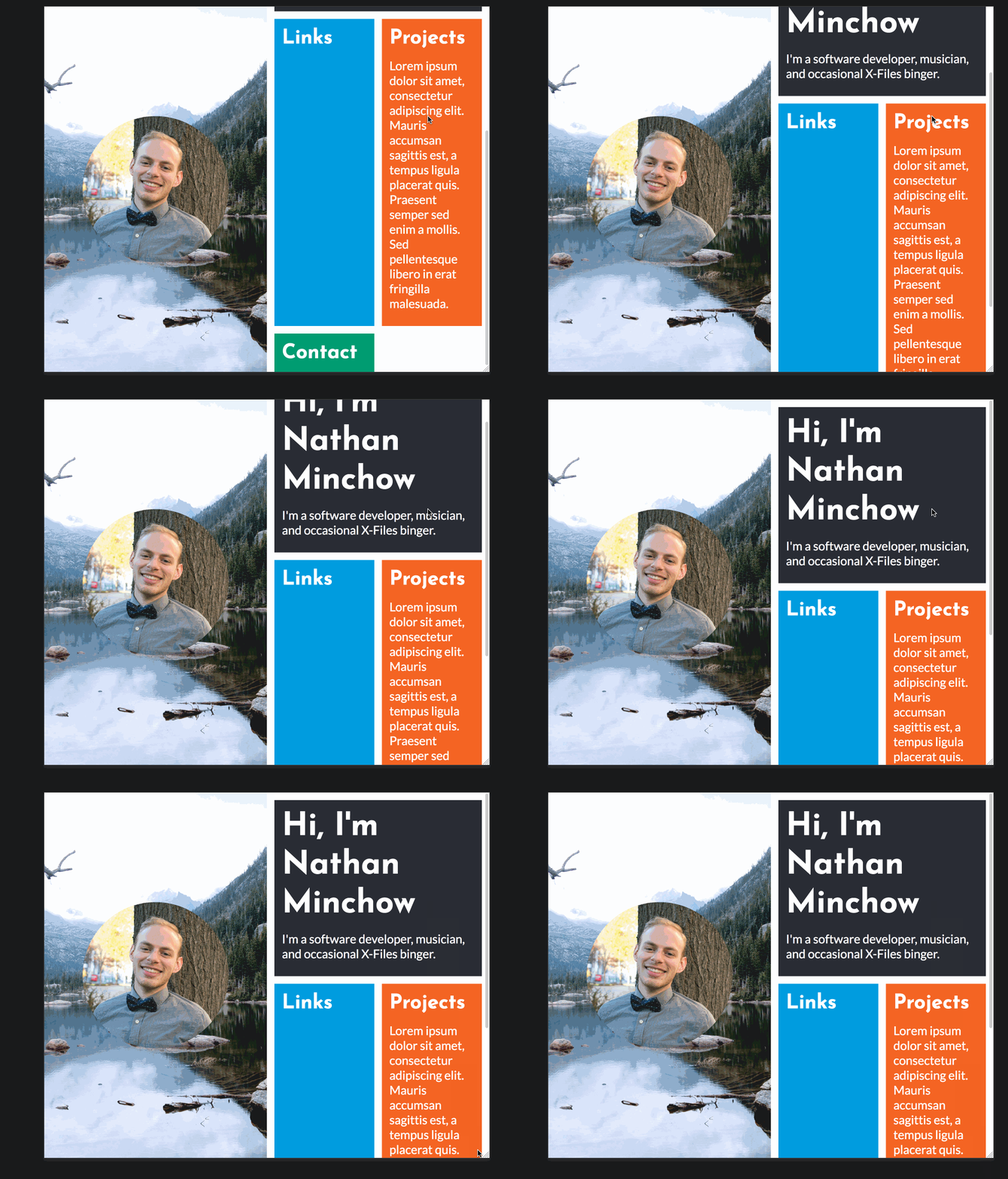
All better! Of course, forcing the user to scroll just because I wanted some fun images on half of the screen wasn’t the best the design decision. So, I retooled some things. I changed the location of the middle divider such that the website was split closer to 25/75, and the boxes were adjusted to take more advantage of the available space. For example, the projects box had more content than the others, so I let it span two rows instead. Eventually, I had this:
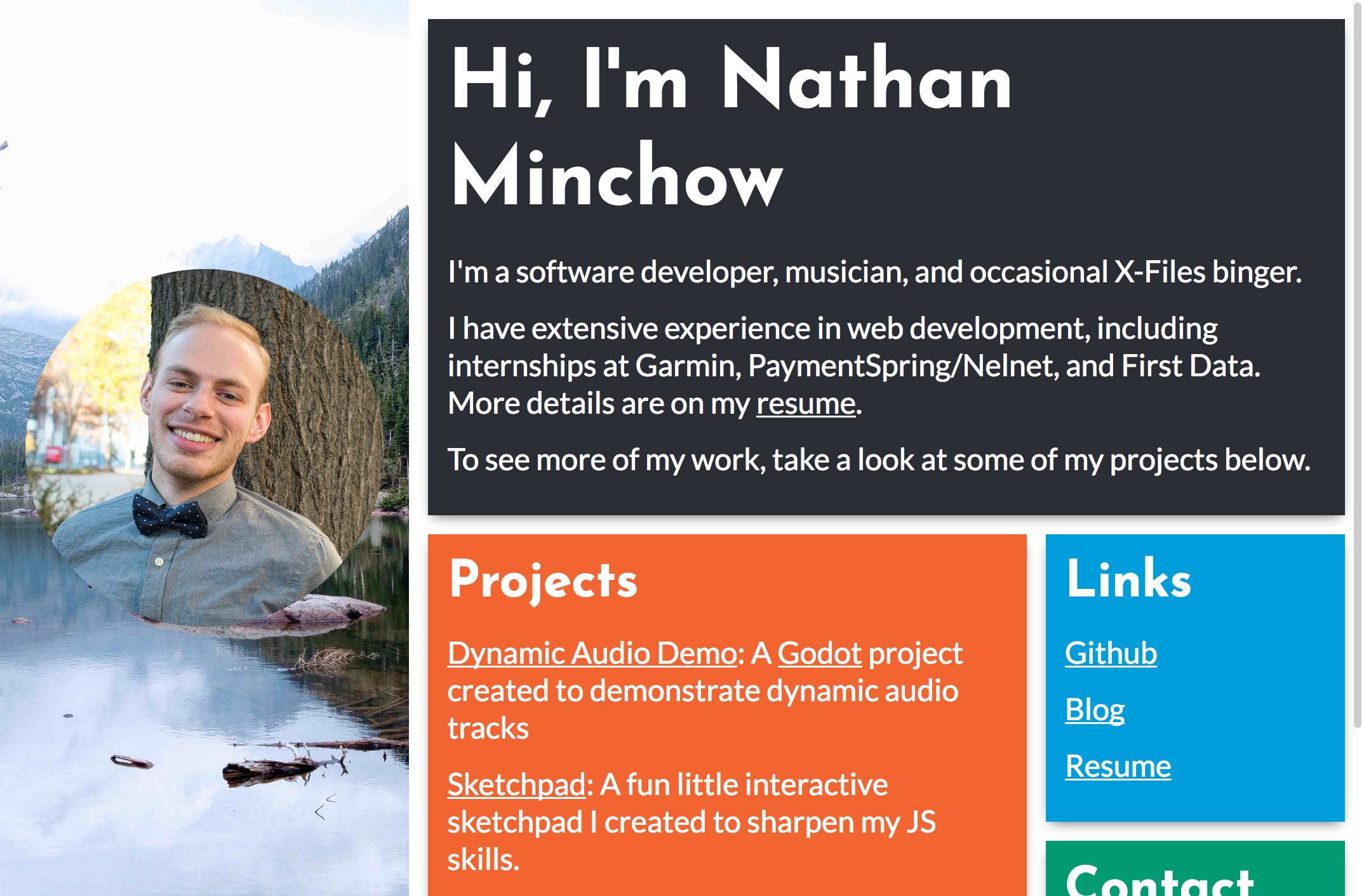
To host the site, I used Github Pages, which I’d heartily recommend to anyone that needs to host a fairly simple static site. There are plenty of other blogs and posts that detail setting up a Github Pages site with a custom domain. I found this one particularly useful. Fun fact: I’m also using Github Pages to host this blog!
I was pleased with the final result, and learned quite a bit about Grid, background images, and responsive layouts along the way. The live version can be found here, with source code available here.